The brief: design a vendor risk platform for enterprise security teams
This design exercise asked me to design an AI-assisted product that helps large enterprise organizations manage, assess, and monitor their third-party vendor risk. The category — Third-Party Risk Management (TPRM) — is well-established, expensive, and widely acknowledged to be broken: most programs run on annual questionnaires, shared spreadsheets, and email threads that create point-in-time snapshots rather than continuous visibility.
Rather than jump straight to screens, I built the product the way a product team would: by understanding the problem space, the real users inside it, the competitive landscape, and the regulatory environment those users have to operate within — then designing a system that addresses all of it as a coherent whole.
"The threat didn't happen at the annual review. It happened five months later, and nobody noticed." — the core failure mode that every design decision in Tessera is built to prevent.
Third-Party Risk Management
AI-Assisted SaaS
Enterprise Security
DORA
EU AI Act
OSFI B-10
Grounding the design in real people and real compliance stakes
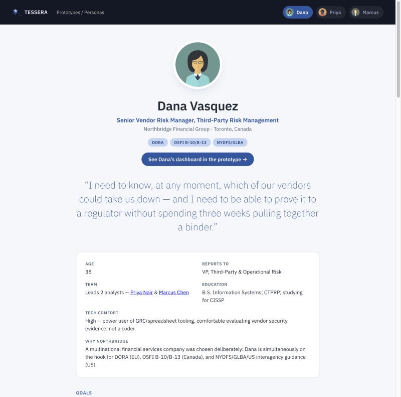
TPRM is a deeply compliance-driven domain — the people doing this work aren't using the product casually, they're using it to satisfy DORA (EU), OSFI B-10/B-13 (Canada), NYDFS, and the EU AI Act simultaneously. That means the users, their pain points, and the specific decisions the product needs to support are all shaped by regulatory obligations, not just workflow preference. I grounded the entire product in three research-derived personas representing the full risk team.
3
Personas spanning manager, senior analyst, and junior analyst roles — each with distinct needs
5+
Real compliance frameworks grounding every persona pain point and product feature
6
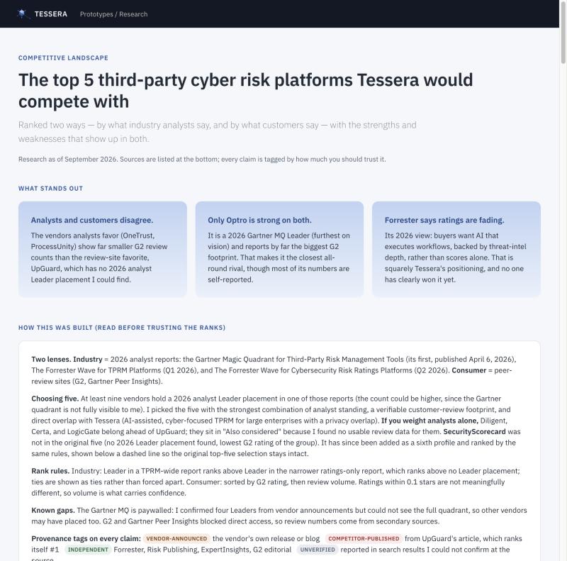
Competitor profiles mapped across Gartner, Forrester, and G2 before any screens were drawn
Dana Vasquez — Senior Vendor Risk Manager. Primary persona: accountable for the complete vendor risk lifecycle across US, EU, and Canadian operations simultaneously.
Competitive landscape — six TPRM platforms profiled across Gartner MQ (2026), Forrester Wave, and G2 customer reviews.
📋
Dana's core problem: point-in-time blindness
A vendor can pass its annual review and get breached five months later with no one noticing until it becomes a crisis. Annual questionnaires don't give Dana the between-cycle visibility DORA and OSFI now require — yet continuous monitoring doesn't exist in her current stack.
📄
Priya's core problem: manual evidence review at scale
Priya reads 60–80 page SOC 2 reports by hand, hunting for exceptions that are often buried on page 47. There's no memory across vendors — when a vendor reappears at renewal, she often starts from scratch because past findings aren't searchable or linked.
🔢
Marcus's core problem: repetitive data entry hiding real urgency
Most of Marcus's day is re-keying vendor questionnaire answers from PDF to spreadsheet. He has no at-a-glance view of what's actually overdue across his queue, no clean way to know whether a vendor is routine or escalation-worthy — and no path toward the technical work that would grow his career.
A design system built from the brand identity outward
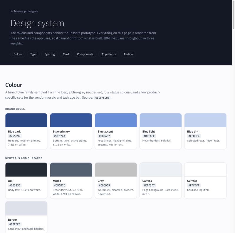
Before designing any screens, I established Tessera's visual identity and design system. The brand centers on a geometric cube mark — the "tessera" as a tile in a larger mosaic — with a blue family sampled directly from the logo's three cube faces: dark (headers, nav), primary (interactive), and accent (data visualization). IBM Plex Sans in three weights carries the product's technical-yet-approachable voice.
Every color token was contrast-audited against WCAG 2.1 AA across white, the canvas background, and each status tint. Status is never communicated by color alone — every badge, pill, and data row pairs color with a text label or icon. The result is a system that holds up under the scrutiny of compliance-driven enterprise buyers.
Tessera design system — color tokens sampled from the brand logo and validated for WCAG AA contrast across every surface in the product.
IBM Plex Sans
Intelligent Third-party
Governance.
ExtraLight · Regular · SemiBold
Technical clarity, approachable voice.
Blue dark
Blue primary
Blue accent
Critical
Low
Tessera type and color system — IBM Plex Sans in three weights; brand blues from the cube mark; status colors audited for WCAG AA on every surface.
🎨
Brand-derived palette
Five brand blues sampled from the logo's three cube faces, plus a neutral ink/muted/canvas set that stays within the blue-gray family throughout
⚠️
WCAG AA status system
Critical, high, medium, and low — each with a separate fill token and a darker text token audited at 4.5:1+ on white, canvas, and tinted backgrounds
Aa
IBM Plex Sans type scale
ExtraLight for display, Regular for body, SemiBold for labels and data — a technical but legible voice matched to enterprise security tooling
▦
Faded card component
Stat cards and panels fade into the canvas at their top edge, creating depth without shadows — a deliberate departure from the heavy-shadow patterns common in the category
✦
AI interaction patterns
A defined set of AI patterns — sparkle icon, confidence scores, inline rationale, human-review prompts — so every AI surface communicates consistently and stays explainable
🧭
Dark nav system
Dark sidebar at #131929 with icon-plus-label nav, badge counts on in-flight work, and a user context footer — separating workspace chrome from product content
The dashboard: four questions Dana answers every morning
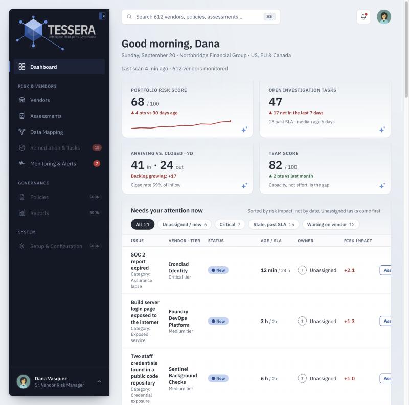
Dana's day starts by triaging overnight risk signals. The dashboard is organized around the four questions that structure her actual morning — not around what data the system happens to have. What needs immediate action? What is the team working on? Are new tasks arriving faster than they're closing? Where is risk actually concentrated in the portfolio?
"The risk score and the arrivals-vs-closed tile are deliberately next to each other. The core story of the product is that risk rises because tasks arrive faster than they close. Placing them together lets Dana see cause and effect without doing the arithmetic."
Tessera dashboard (Dana's view) — portfolio risk score, open investigation tasks, arrivals vs. closed trend, and team score at a glance. Investigation task list sorted by risk impact, not date.
1
Health check — four tiles, five seconds
Portfolio risk score (0–100 with 30-day trend), open investigation tasks with SLA breach count, arrivals vs. closed over 7 days, and team score. The portfolio score and the backlog tile sit side-by-side because the causal relationship between them is the story of the product.
2
Needs attention — sorted by risk impact, not date
The task list is sorted by how many points each open issue adds to the portfolio score right now. Unassigned tasks always surface first — they're the only tasks nobody is working on. Action buttons change state: Assign, Open, Nudge, Escalate — matching what Dana actually does at each stage.
3
Task age split by who is causing the delay
"Waiting on vendor" and "waiting on our team" are shown separately — because they call for different actions. If delays are on the team side, Dana rebalances workload. If they're on the vendor side, she escalates to a senior vendor contact. A single average-age number hides which is happening.
4
Continuous scan mosaic — ambient, not primary
The 612-vendor mosaic sits at the bottom of the page by design. It builds trust that Tessera is watching, but Dana can't take action directly from it. Placed low, it works as reassurance without competing for space with the action list above it.
Five interconnected screens covering the full risk lifecycle
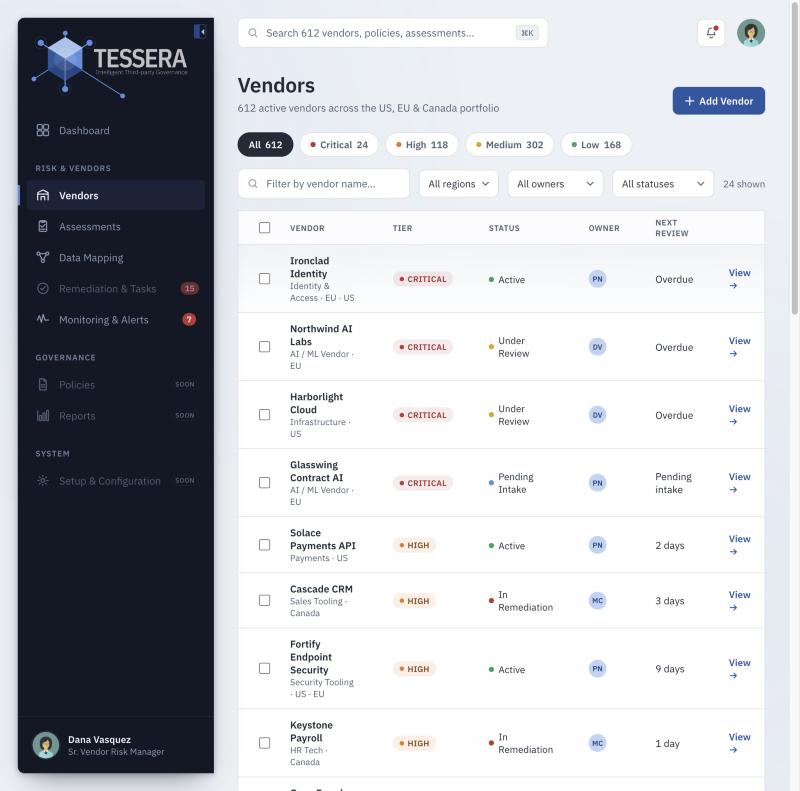
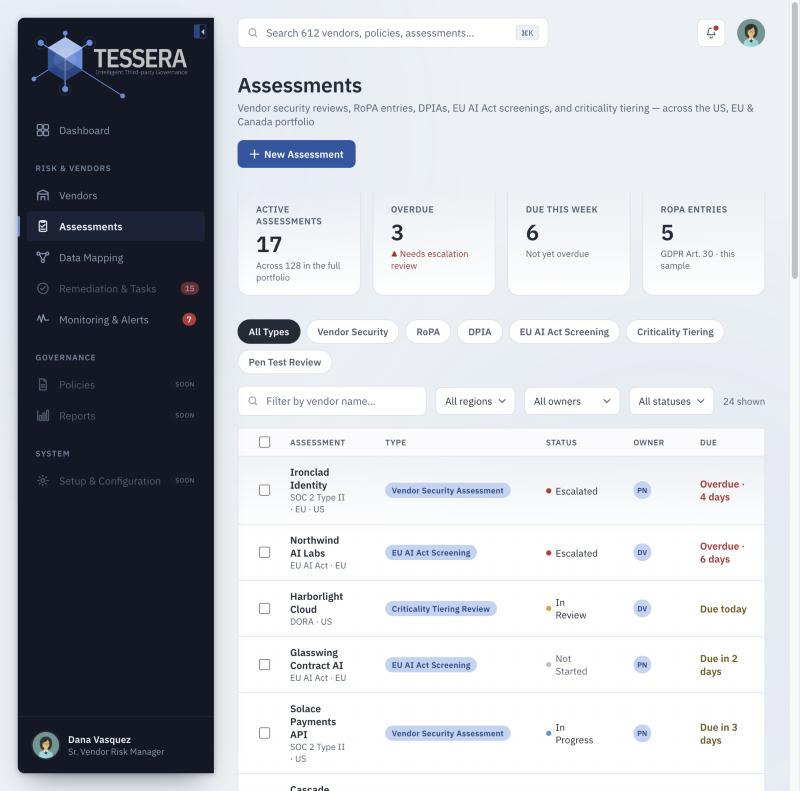
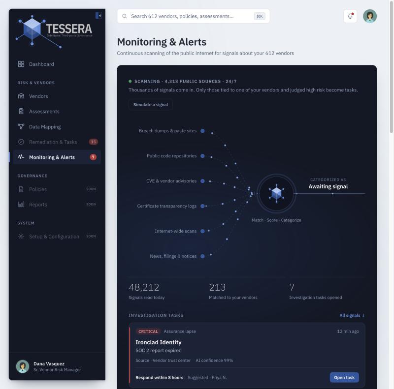
The prototype covers the complete vendor risk workflow — from initial intake and continuous monitoring through evidence review, assessment tracking, and data mapping. Each screen is designed for its primary user while sharing the same shell, navigation, and status system, so the team can move between contexts without a jarring shift in mental model.
Vendor register — 612 active vendors filterable by tier (Critical 24, High 118, Medium 302, Low 168), region, owner, and status. Criticality tiering applied automatically against DORA, OSFI, and US interagency criteria.
Assessments — vendor security reviews, RoPA entries, DPIAs, EU AI Act screenings, and criticality tiering in one queue. Type filter chips let Priya and Marcus work their own slice without switching tools.
Monitoring & Alerts — continuous scanning of 4,318 public sources (breach dumps, public code repos, CVE feeds, certificate transparency logs, internet-wide scans, news & filings) with AI matching each signal to Northbridge's vendor portfolio in near real-time.
Three design decisions that shaped the product
Every product has moments where the direction could go one of several reasonable ways. These three decisions were the ones that most directly determined what Tessera became — and what it explicitly chose not to be.
🔄
Continuous monitoring as first-class, not add-on
Every competitor treats ongoing monitoring as a secondary module bolted onto an assessment workflow. Tessera inverts this: the dashboard's primary surface is the investigation task list fed by continuous signals. Assessments are still required — but the product's core value is the signal coverage between them, not the assessments themselves.
🤝
AI assists; humans decide — by design, not as a caveat
Every AI-assisted finding in Tessera has a confidence score, a source reference, and an explicit human-review step before it changes a vendor's risk posture. This is a deliberate design decision — EU AI Act and NIST AI RMF both require explainability and human-in-the-loop review for high-risk AI applications. Tessera's compliance positioning is itself a product differentiator, not just a legal constraint.
📊
The team score shows components, not a ranking
The dashboard includes a team performance score — but it deliberately shows its four components (closed on time, time to verify, vendor follow-ups, reopen rate) rather than a single rank. Marcus is sensitive to SLA misses and re-keying errors as reputational — a bare leaderboard would erode trust in the tool. Priya's escalation bottleneck would read as underperformance without context about her workload split. The score is designed as a coaching signal, not a ranking.
What Tessera delivers for each member of the team
Dana
One continuously updated register, audit-ready reporting mapped to DORA/OSFI/NYDFS, and visibility into between-cycle risk without weeks of prep
Priya
AI pre-reads SOC 2 reports and surfaces exceptions with direct page references — so her time goes to judgment calls, not document hunting
Marcus
Automatic questionnaire ingestion eliminates re-keying; a prioritized SLA queue replaces deadline tracking by memory and spreadsheet
What was built and delivered
✓
Three research-grounded personas — Dana (Vendor Risk Manager), Priya (Senior Analyst, EU coverage), and Marcus (Analyst I, US intake) — each with compliance-specific pain points, a day-in-the-life, and a clear account of how Tessera changes their work
✓
Competitive landscape research — six TPRM/cybersecurity risk platforms profiled across Gartner MQ, Forrester Wave, and G2, with sourcing transparency on every claim
✓
A complete design system — Tessera brand identity, color tokens (WCAG AA audited), IBM Plex Sans type scale, faded card component, status system, and AI interaction patterns documented as a living style guide
✓
Five working prototype screens — Dashboard (Dana's view), Vendor Register, Assessments, Monitoring & Alerts, and Data Mapping — all interconnected in a functional HTML prototype with live data, AI chat, and continuous scan simulation
✓
Dashboard design rationale — a documented decision record covering section order, component specs, scoring formulas, SLA definitions, and open design questions — written to hand off to a product team or to revisit in a second iteration
Reflection
What I found most interesting about this exercise was how much the compliance landscape directly shapes the UX. Dana isn't just trying to do her job efficiently — she's trying to do her job in a way that satisfies three different regulatory regimes with overlapping but non-identical definitions of "critical vendor." That's a genuinely hard UX problem: how do you give someone a single system of record when the legal definition of what that record needs to contain is different in Toronto, London, and New York?
Tessera's answer — a unified register with framework-specific views, plus AI that can pre-flag EU AI Act relevance before it becomes an ad hoc Legal escalation — is a design solution to a regulatory fragmentation problem. That's the kind of product thinking I find most compelling: when the interface is the solution to a problem that isn't, on the surface, an interface problem at all.