01 — Context
A homepage request that revealed a system problem
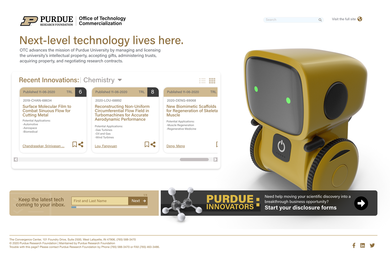
The Purdue Research Foundation's Office of Technology Commercialization (Purdue OTC) is one of the most comprehensive technology transfer programs among leading research universities in the United States. The organization protects Purdue's intellectual property and leads technology transfer activities for patented innovations — innovations now used in more than 100 countries worldwide by millions of people.
Purdue OTC approached us with a focused request: redesign their homepage. What we discovered through rigorous research was a far more systemic challenge — one that, if left unaddressed, would have made any homepage redesign a cosmetic fix to a structural problem.
The stated problem is rarely the actual problem. Purdue OTC asked for a homepage redesign. What they needed — and what this engagement delivered — was a rethinking of how their entire digital presence served the people who needed to use it most.
02 — The Challenge
Beyond the homepage
Through stakeholder interviews, user research, and a thorough audit of the existing site, it became clear that the homepage was not the root problem — it was a symptom of deeper structural issues. The existing site failed its most critical audience — technology scouts and investors — in three fundamental ways.
🏷️
Incorrect Taxonomy
Discoveries were categorized in ways that didn't align with how technology scouts and investors search for and classify technologies. Industry-standard classifications were absent, making efficient browsing nearly impossible.
🔍
Broken Discovery Experience
The search and listing interfaces were awkward and returned inefficient results. Technology scouts could not quickly scan for new discoveries relevant to their investors' interests — a core job the site needed to support.
📄
Unconsumed Documentation
Technology disclosures and innovation PDFs were poorly structured — non-descriptive titles, no clickable links, and content that didn't meet the standard format scouts need to catalog and present to investors.
With these discoveries in hand, the project shifted from a homepage facelift to a comprehensive UX research and design engagement aimed at rethinking how Purdue packaged, presented, and connected its innovations with the right audiences at the right time. The ecosystem involved four distinct user groups whose needs had to be balanced:
01
Purdue Researchers, Scientists & Professors — inventors seeking to disclose and commercialize their work
02
Technology Scouts — industry professionals who identify innovations to recommend to investors
03
Investors & Licensees — organizations seeking to license or fund Purdue technologies
03 — Research & Discovery
Understanding the ecosystem
A multi-method research approach was used to develop a holistic understanding of all user groups — their workflows, pain points, and mental models. Discovery was structured across four key activities, each designed to surface different layers of the problem.
1
Stakeholder Sessions
Collaborative sessions using digital whiteboarding tools to map the current state, surface organizational goals, and align on project priorities — covering the purpose of the OTC digital presence, how success is measured, and who is actually visiting the site and whether they find what they need.
2
Current Process Walk-Through
A detailed walkthrough of the existing site and internal workflows to document the current user experience from both an inventor and licensee perspective — revealing the disconnect between how OTC organized content and how technology scouts actually searched for innovations.
3
User Interviews
Structured interviews across user groups focused on demographics and domain expertise, current workflows for discovering university technologies, step-by-step task flows, pain points with the existing site, the language users actually use, and what tools and formats would improve their workflow.
4
Empathy Mapping — The Technology Scout
A detailed empathy map was developed for the primary external user: the Technology Scout. This artifact captured what scouts see, think, feel, and do when working with university technology transfer sites — grounding all subsequent design decisions in the realities of their workflow.
04 — UX Artifacts
Synthesizing research into direction
Research findings were synthesized into a suite of UX artifacts that grounded design decisions in observed user behavior and business process realities. These artifacts became the shared language between research, design, and stakeholders — ensuring every structural decision that followed was traceable to something a real user said or did.
🗺️
Inventor & Licensee Journey Map
A dual-track journey map visualizing the end-to-end experience for both inventors and licensees — from initial awareness through campaign, landing page engagement, onboarding, and follow-up. Key emotions revealed that both groups experienced frustration at the browsing and engagement stages due to lack of guidance and inadequate content depth.
📐
Service Blueprint
A service blueprint documenting the full ecosystem of people, processes, and technology supporting the digital experience — frontstage content publishing (WordPress, HubSpot, Absorb LMS), backstage OTC and PRF staff operations, and support processes (Google Drive, Salesforce CRM).
👤
Primary Inventor Personas
Two primary inventor personas defined to represent the Purdue research community — capturing the goals, workflows, and barriers of faculty researchers navigating the disclosure and commercialization process for the first time and returning users managing active IP portfolios.
🧭
Technology Scout Empathy Map
A detailed empathy map for the primary external audience — capturing what scouts see when evaluating competing TTO sites, what they think when navigating innovation databases, what they feel when they can't find what they need quickly, and what they do to compensate for poor IA.
05 — Information Architecture
Mapping the current state
A comprehensive sitemap of the existing OTC website was developed to document and analyze the full information architecture. The existing structure revealed significant complexity working against the needs of all user groups — a site organized around internal process logic rather than user need.
The main navigation included seven top-level items — Technologies, About, Licensing, Resources, Trask Innovation Fund, News, and Contact Us — with nearly every item containing deep dropdown sub-navigation. No clear role-based navigation existed. A technology scout and a researcher submitting a disclosure were expected to navigate the same undifferentiated site.
The sitemap analysis confirmed three architectural failures that compounded the taxonomy and documentation issues found in user research:
📂
Depth Over Accessibility
Key tasks required multiple clicks through dropdown menus with no progressive disclosure or user-type orientation. Critical information was reachable only after navigating three or four levels deep.
🏢
Internal Logic Externalized
The site's structure mirrored OTC's internal org chart rather than the user's mental model or task flow. Categories and labels made sense to staff but created confusion for scouts, investors, and inventors alike.
🔎
No Technology Browsing Experience
Innovations were accessible through search only, with no browsable category structure aligned to industry-standard classifications. Scouts couldn't scan the portfolio quickly — they had to know exactly what they were looking for before they could find anything.
06 — Wireframes
Rethinking the experience
With research findings and architectural analysis complete, wireframes were developed to explore new structural and interaction patterns that would serve all user groups while prioritizing the technology scout and investor experience. A central design decision was to introduce explicit role-based entry points on the homepage.
💼
For Investors
Surfacing trending technologies, category snapshots, and licensing pathways — giving scouts the "quick scan" experience they described as essential for regular return visits.
🔬
For Inventors
Clear paths to disclosure forms, inventor resources, and the Purdue Inventor Hub — cleanly separated from the licensee/investor experience with no ambiguity about where to go.
📊
Top 5 Trending Research Categories
Dynamic, data-driven category blocks showing innovation counts (e.g., Electrical Engineering: 243, Mechanical Engineering: 207) — giving scouts an immediate sense of portfolio depth and breadth on every visit.
🔧
Technology Quick Search
A simplified, prominent search interface with category, subcategory, and date filters aligned to how scouts actually query innovation databases — not how OTC internally categorizes IP.
Supporting content modules wireframed for the redesigned homepage included quarterly report statistics and success stories to reinforce Purdue's commercialization track record, an upcoming tech events calendar, and a category-specific newsletter signup allowing scouts to receive alerts only for the technology areas relevant to their portfolio.
07 — Design Concepts
Bringing it to life
Visual design concepts translated the wireframe structures into a high-fidelity direction that honored Purdue's brand while creating a modern, credible digital experience that could compete with top-tier technology commercialization offices globally. The visual concept centered on three qualities most important to technology scouts, investors, and inventors navigating the site.
Authority
Dark hero treatment with bold, full-width messaging communicating scale and ambition to arriving scouts and investors immediately
Innovation
Gold and dark palette used with intention — Purdue brand colors for calls to action and key data points, dark backgrounds for authority and focus
Accessibility
Data-forward category grid with innovation counts giving scouts an immediate sense of portfolio depth and breadth without any searching required
A redesigned technology listing page resolved the taxonomy issues identified in research — replacing internal classifications with industry-standard categories, adding filterable attributes (People, Keywords, Categories), and introducing lead inventor attribution and bookmark functionality allowing scouts to curate shortlists for investor presentations.
A dedicated licensing module — "License a technology for your business, easily" — was introduced alongside a "Reasons to Believe" section anchoring Purdue's credentials (#6 in the world for patents, 400+ innovations available, 100+ countries) immediately below the technology browsing experience.
08 — Prototypes
Validating the solution
High-fidelity interactive prototypes were developed to validate the redesigned experience with users before development handoff. The prototype covered the full homepage experience, the technology browsing flow, the inventor disclosure pathway, and the licensing engagement flow.
1
Homepage
Role-based orientation, trending categories, technology quick search, and dynamic content modules — the full entry-point experience for both scouts and inventors.
2
Technology Browse
Category-filtered listing with improved taxonomy, bookmarking, and inventor attribution — designed around the scout's actual research workflow, not OTC's internal filing system.
3
Inventor Path
Disclosure submission flow, Purdue Inventor Hub, and resource navigation — a step-by-step journey that reduced the ambiguity inventors described as their primary barrier to engaging OTC.
4
Investor / Licensee Path
Technology deep-dive pages, licensing process overview, and OTC contact flow — giving investors a clear, frictionless path from technology discovery to licensing conversation.
Prototype testing with technology scouts confirmed the core hypotheses developed during research: role-based entry points eliminated the primary navigation confusion reported in interviews, the restructured taxonomy dramatically reduced time-to-find, and the trending technologies module created the "quick scan" experience scouts described as essential for regular return visits.
09 — Insights & Outcomes
What we learned
This project reinforced a fundamental truth about UX research: the stated problem is rarely the actual problem. Purdue OTC asked for a homepage redesign. What they needed — and what this engagement delivered — was a rethinking of how their entire digital presence served the people who needed to use it most.
Key outcomes delivered
✓
Scope expansion through research. By investing in discovery before touching design, the project moved from a surface-level cosmetic update to a systemic solution with real business impact.
✓
Taxonomy realigned to industry standards. The discovery that technology listing taxonomy was misaligned with industry expectations was the pivotal insight that redirected the entire engagement.
✓
Direct bridge from inventors to the market. The redesigned experience created a navigable connection between Purdue's researchers and the investors and scouts who could bring their discoveries to market.
✓
Scout-first information architecture. By designing for the scout's workflow — not the institution's org chart — the platform became a tool scouts could return to regularly and rely on for their work.
Reflection
Expanding scope through research before touching design is an act of trust — the client came with a specific ask, and we had to demonstrate enough rigor early to earn the right to reframe the problem. The research wasn't just about gathering data; it was about building the shared understanding that made a broader solution possible.
The design principles that guided this work — authority, innovation, and accessibility — weren't chosen arbitrarily. They came directly from what technology scouts described in interviews as the qualities that make them trust and return to a technology transfer site. That's the difference between designing for a user and designing with one.