A complex e-commerce platform built from scratch
Schlage is a leading manufacturer of locks and security hardware — a brand with a broad consumer base, a complex product catalog, and a website that wasn't keeping pace with how people shop. This was a large, enterprise-level e-commerce redesign currently in production, covering the full spectrum of UX activity: from initial discovery and stakeholder alignment, through strategy and tiered release planning, to final design system delivery.
My role as UX Director meant owning both the research-to-design process and the systems that would govern how that design scaled. No off-the-shelf templates — every pattern, component, and interaction model was defined, tested, and documented from the ground up.
"The heart of any project is the design system. Think of a style guide, pattern library, and component library all rolled into one — a single source of truth that evolves with the project."
Understanding the customer before touching a frame
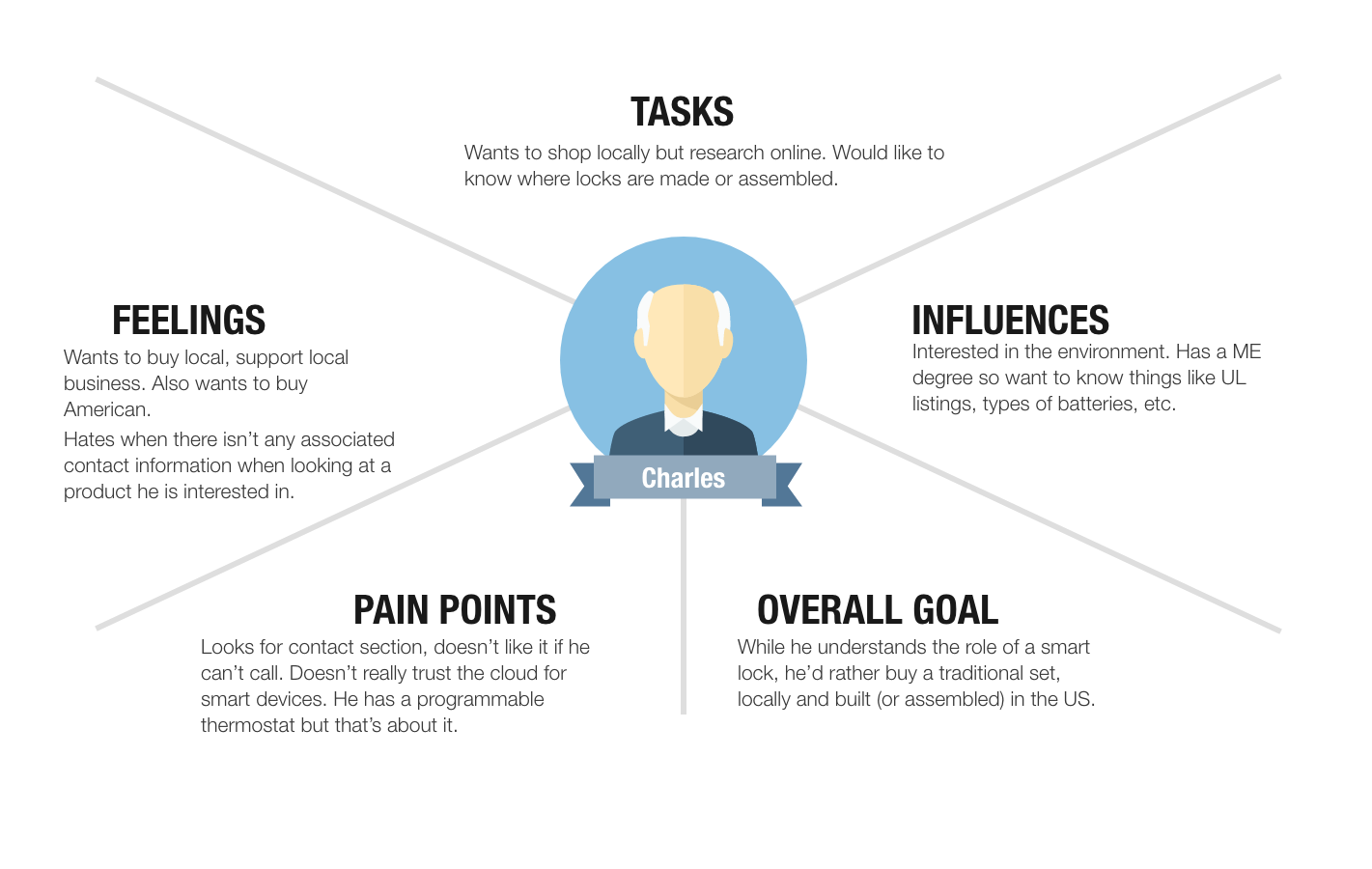
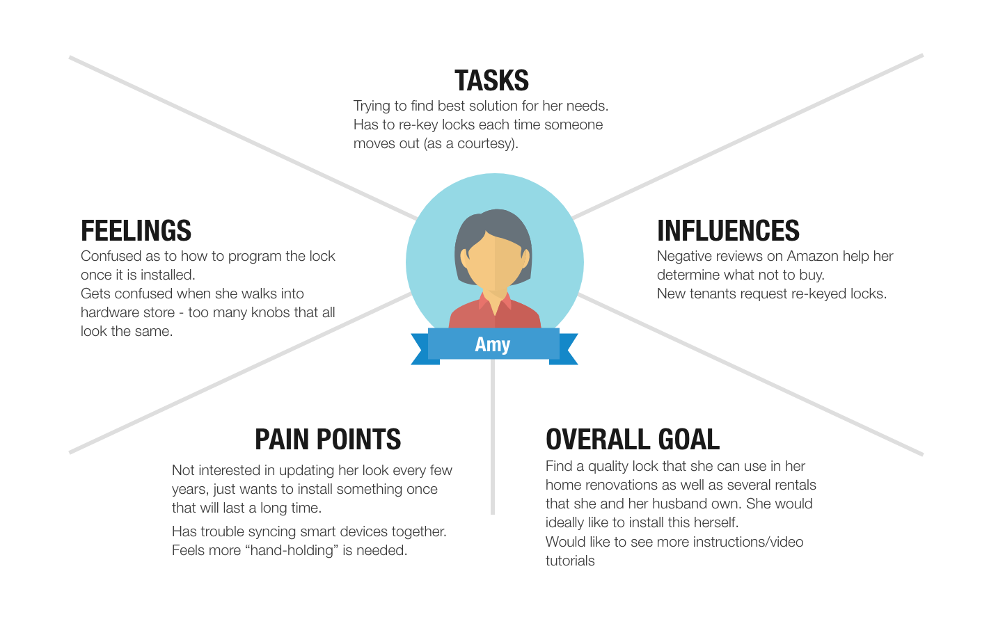
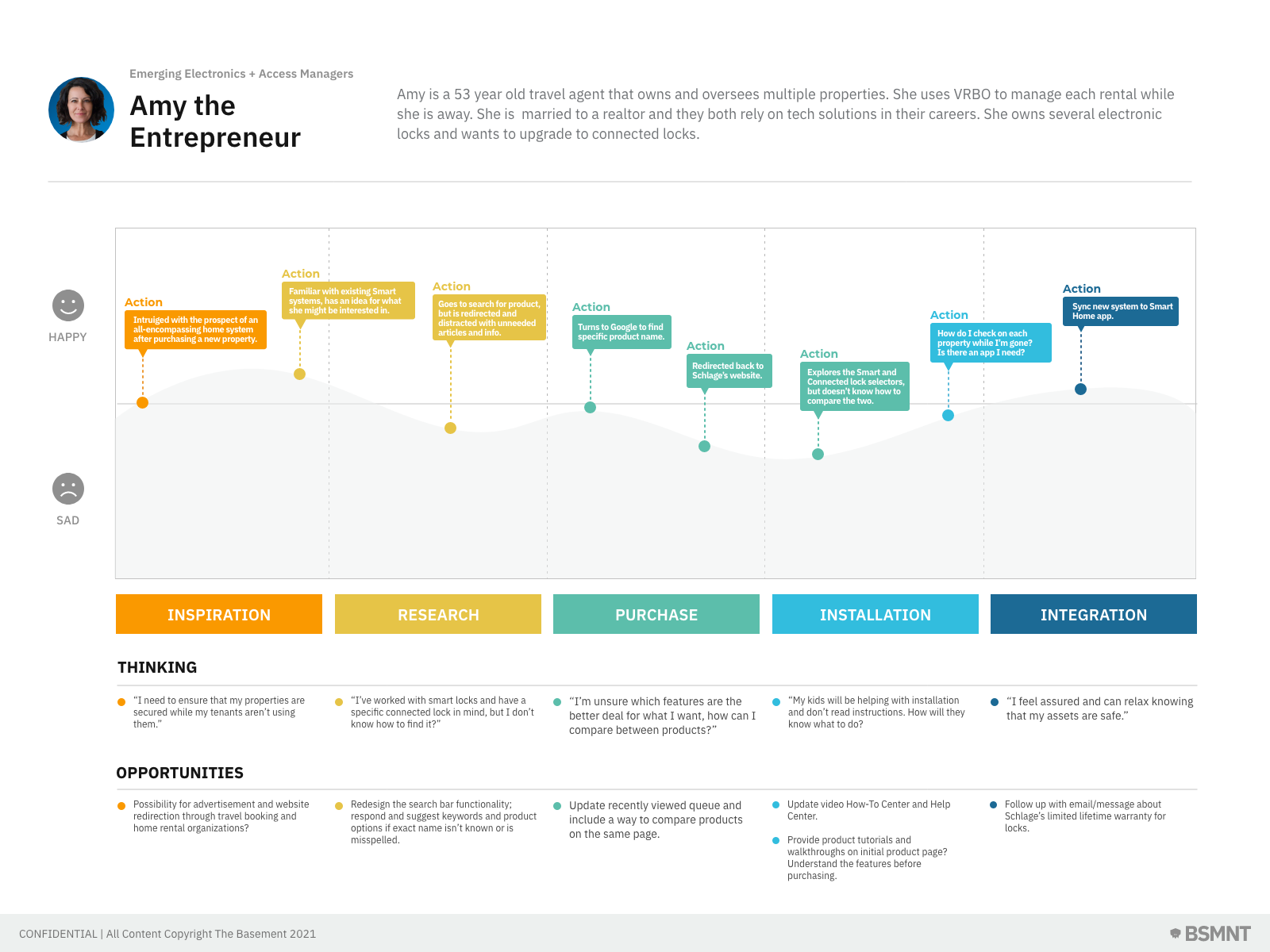
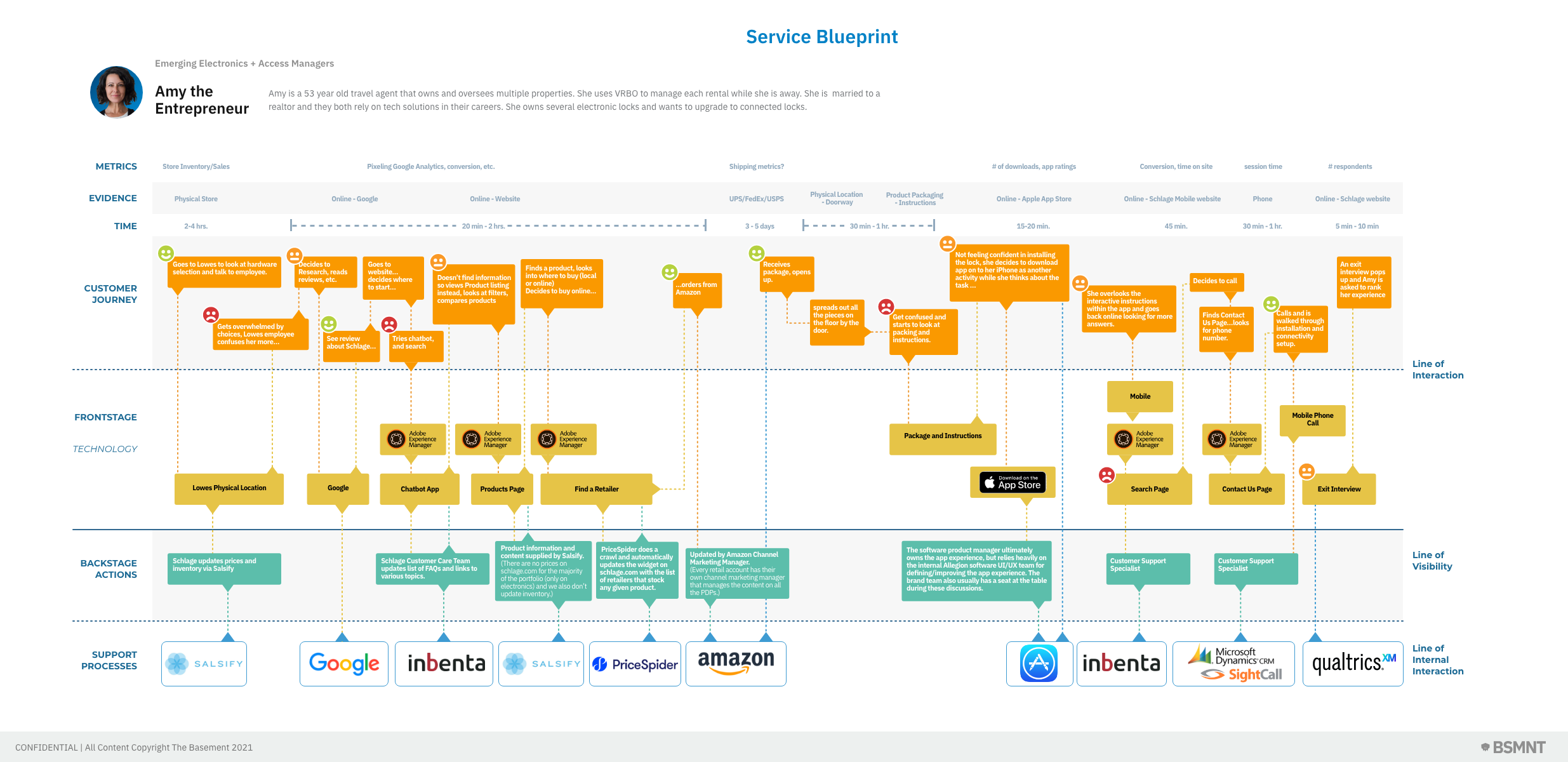
Every project starts with understanding people — both the users and the business stakeholders behind them. I conducted heuristic evaluations of the existing site alongside stakeholder interviews to calibrate user empathy against business objectives. That groundwork informed a deeper research phase: end-user interviews, usability testing on existing flows, site heuristics, and technology audits to understand platform constraints before making design decisions.
The research phase produced a suite of artifacts that gave the project team a shared model of who we were designing for and what their experience actually looked like — not just what the business assumed it to be.
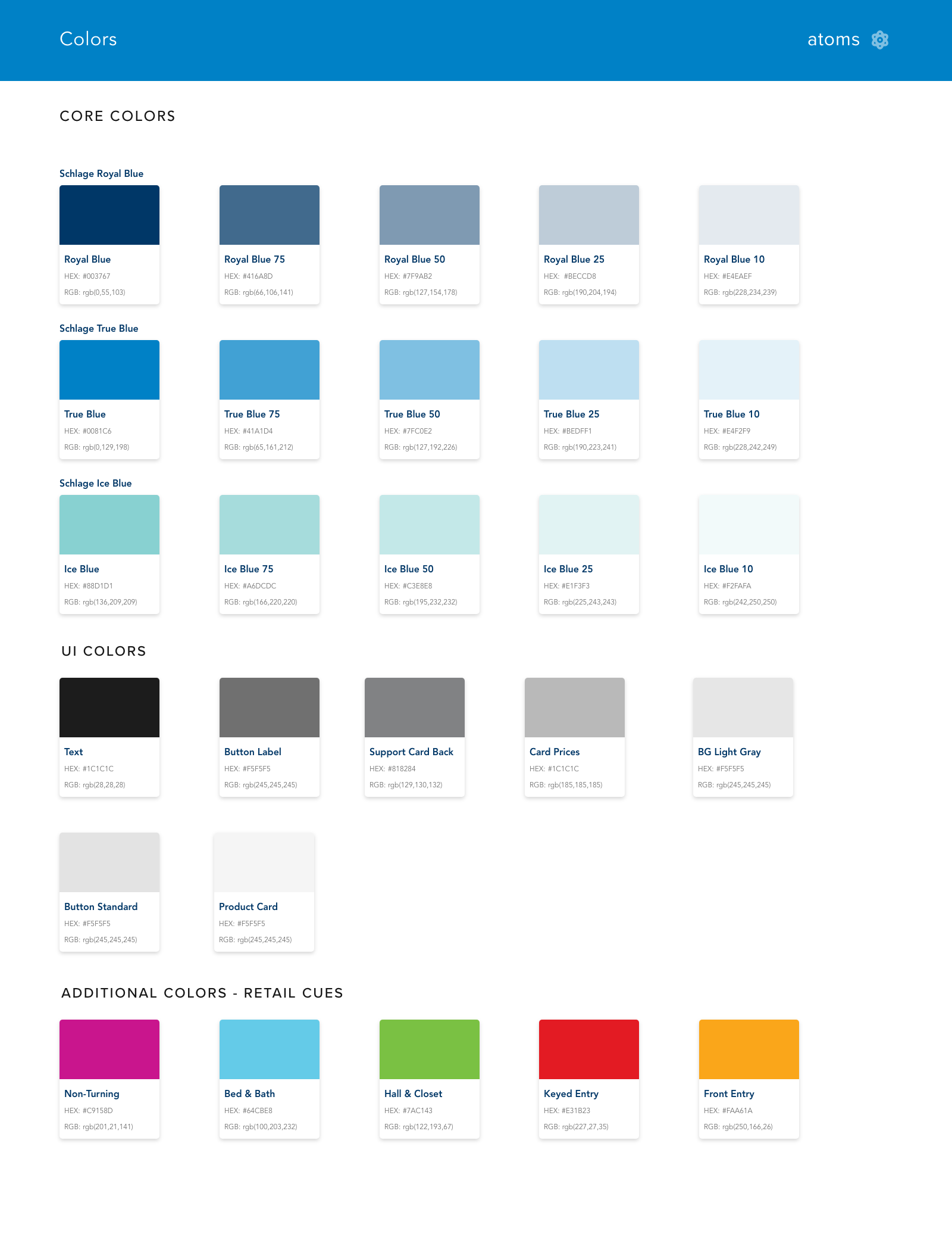
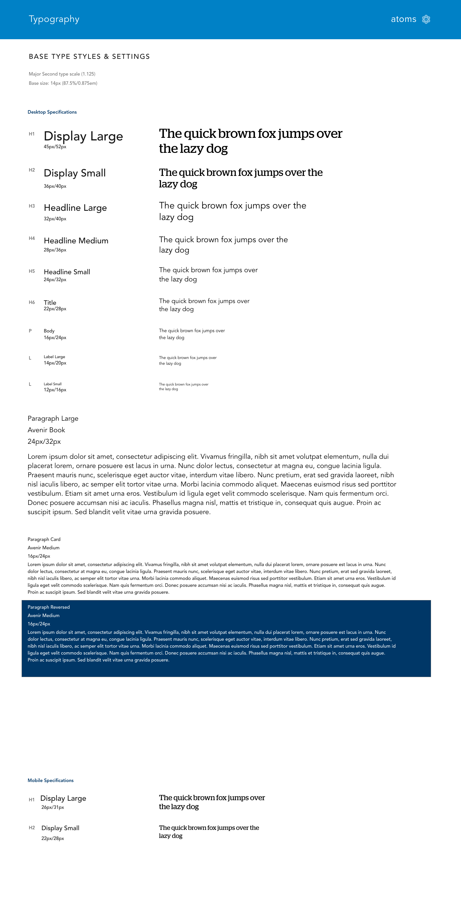
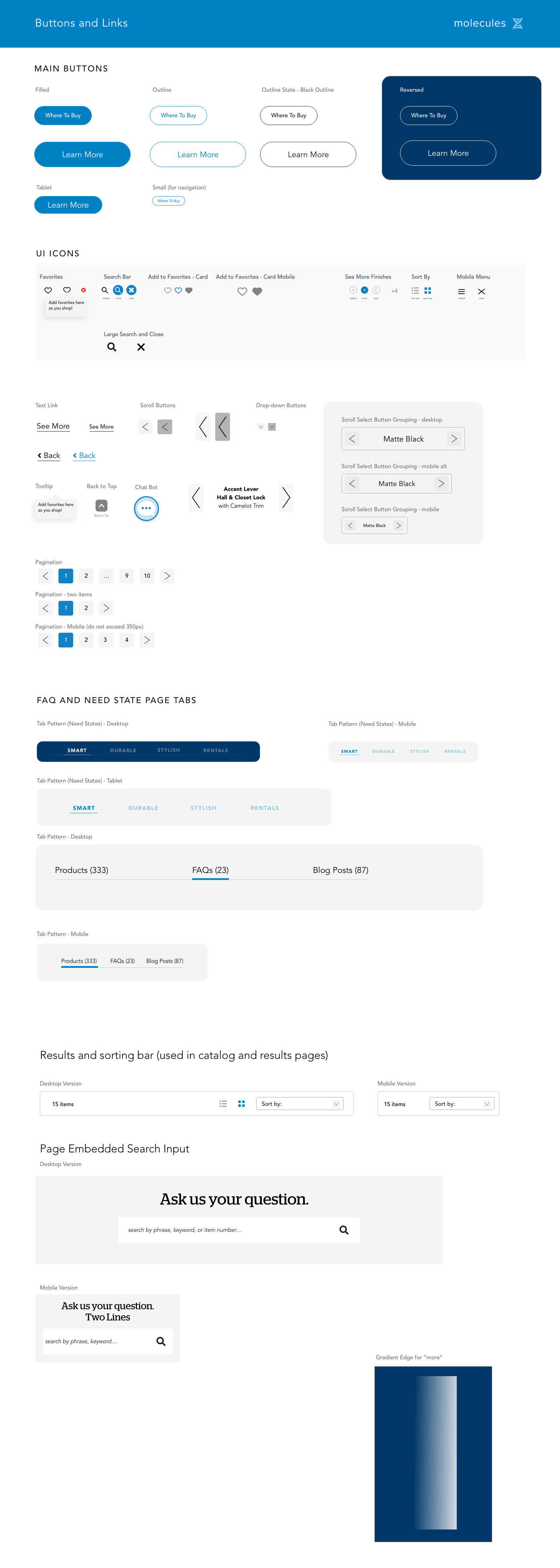
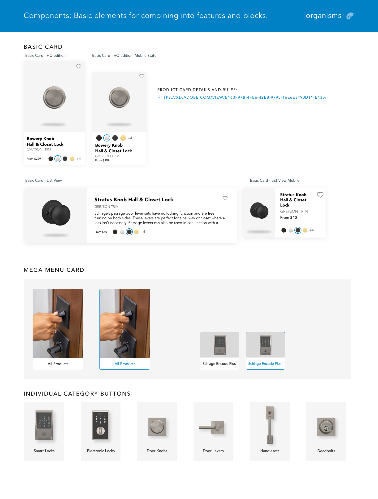
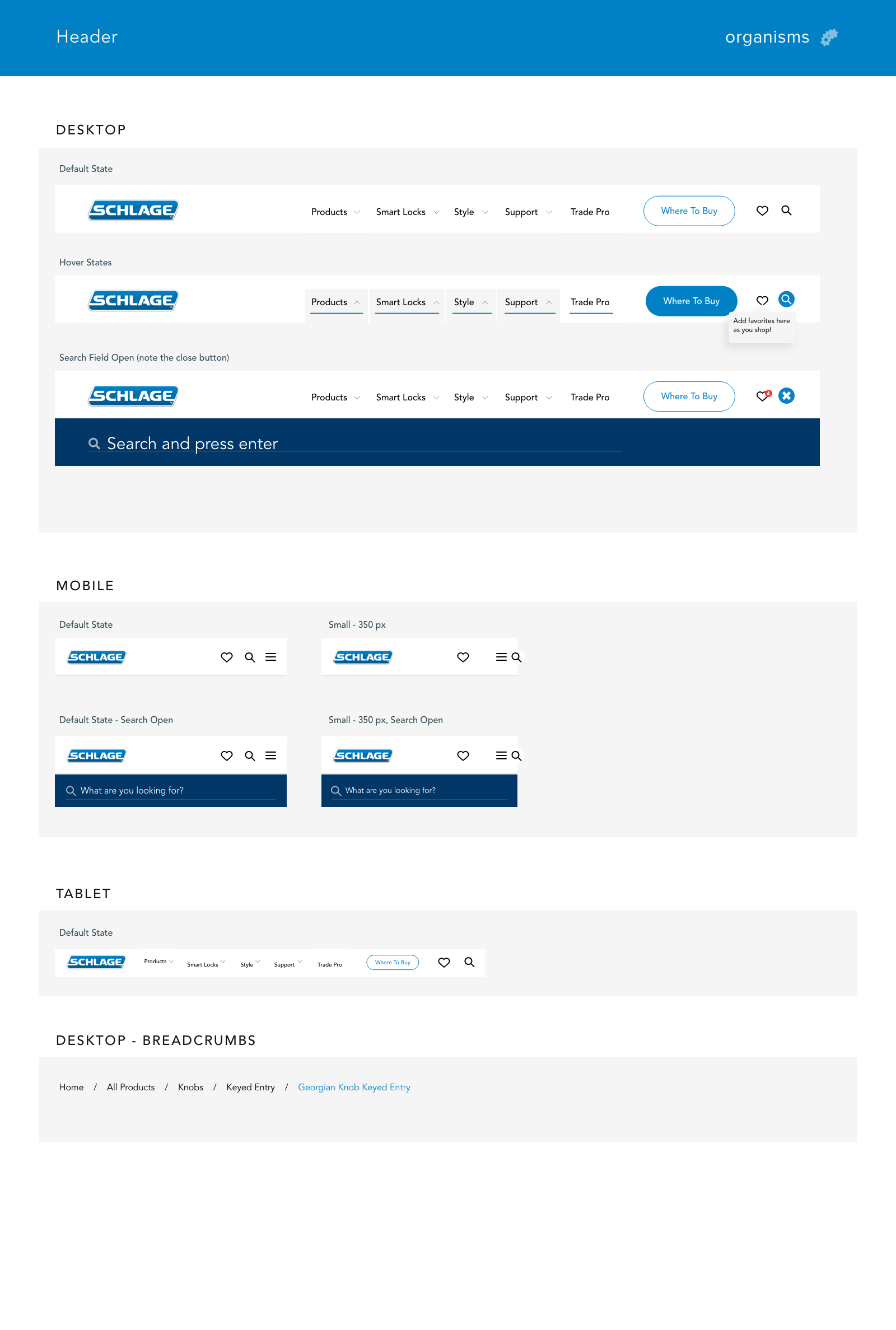
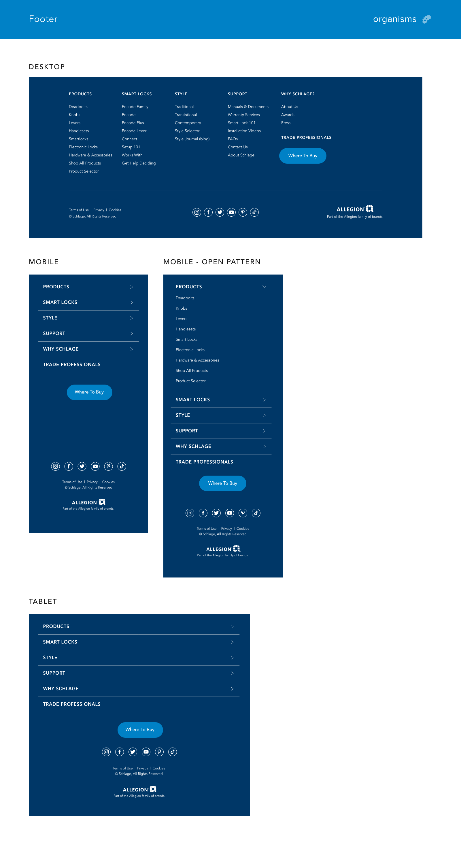
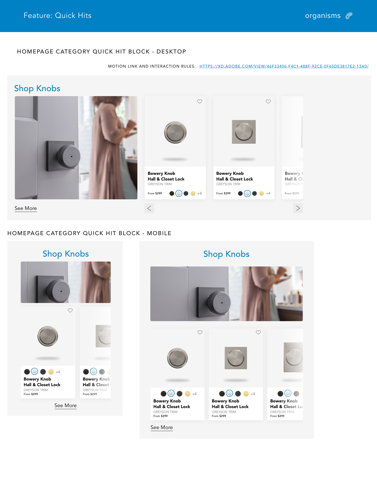
Building the atomic foundation first
Before designing pages, I established the design system — the single source of truth that would govern every decision made downstream. I adopted the Atomic Design Methodology, organizing the system into hierarchical levels: Atoms (colors, typography), Molecules (buttons, icon pairs), Organisms (headers, footers, feature blocks), and Templates. Implemented using Adobe XD's component library, any change made at the atomic level cascaded automatically across every team artboard.
The result was a living document that saved measurable design and development time — changes at any organizational level kept all designs up-to-date without manual rework, and gave the development team a clear, unambiguous specification at every stage of implementation.
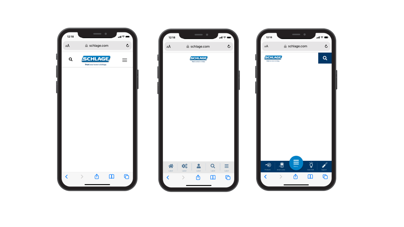
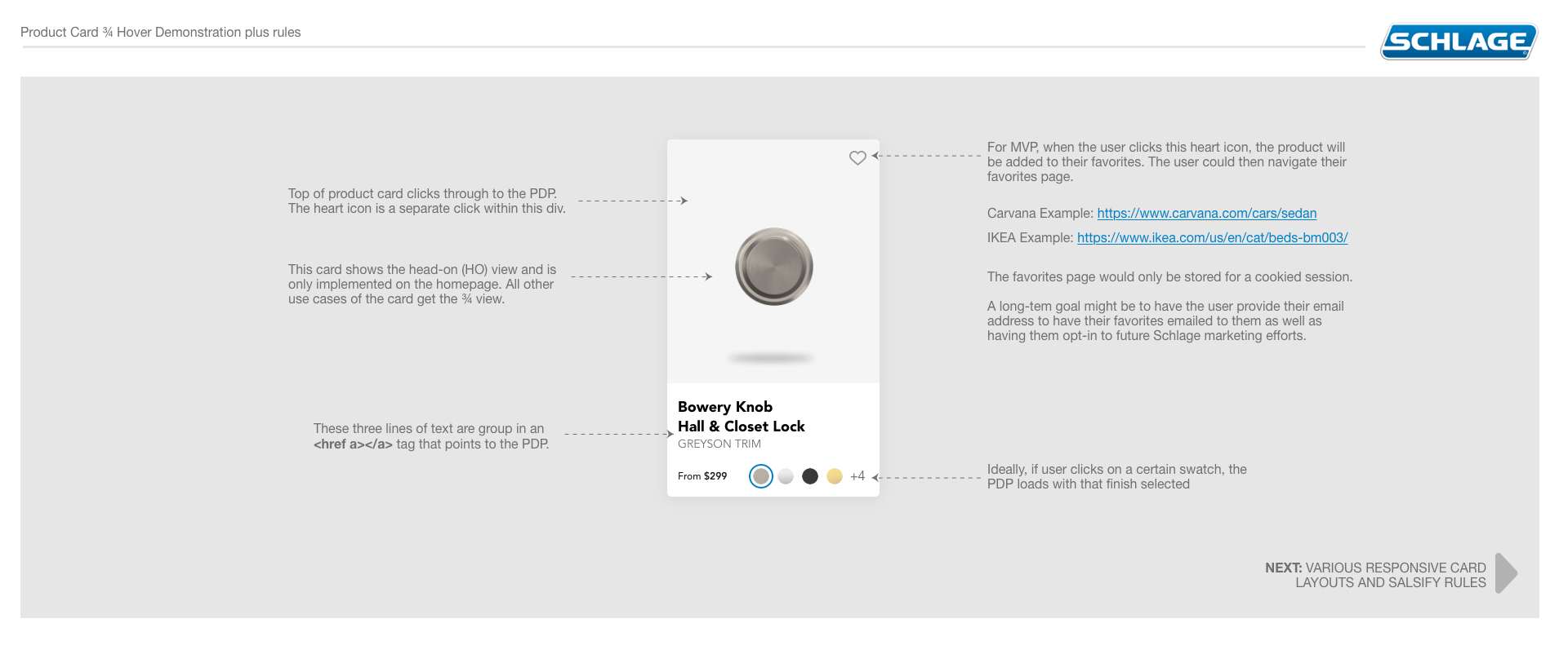
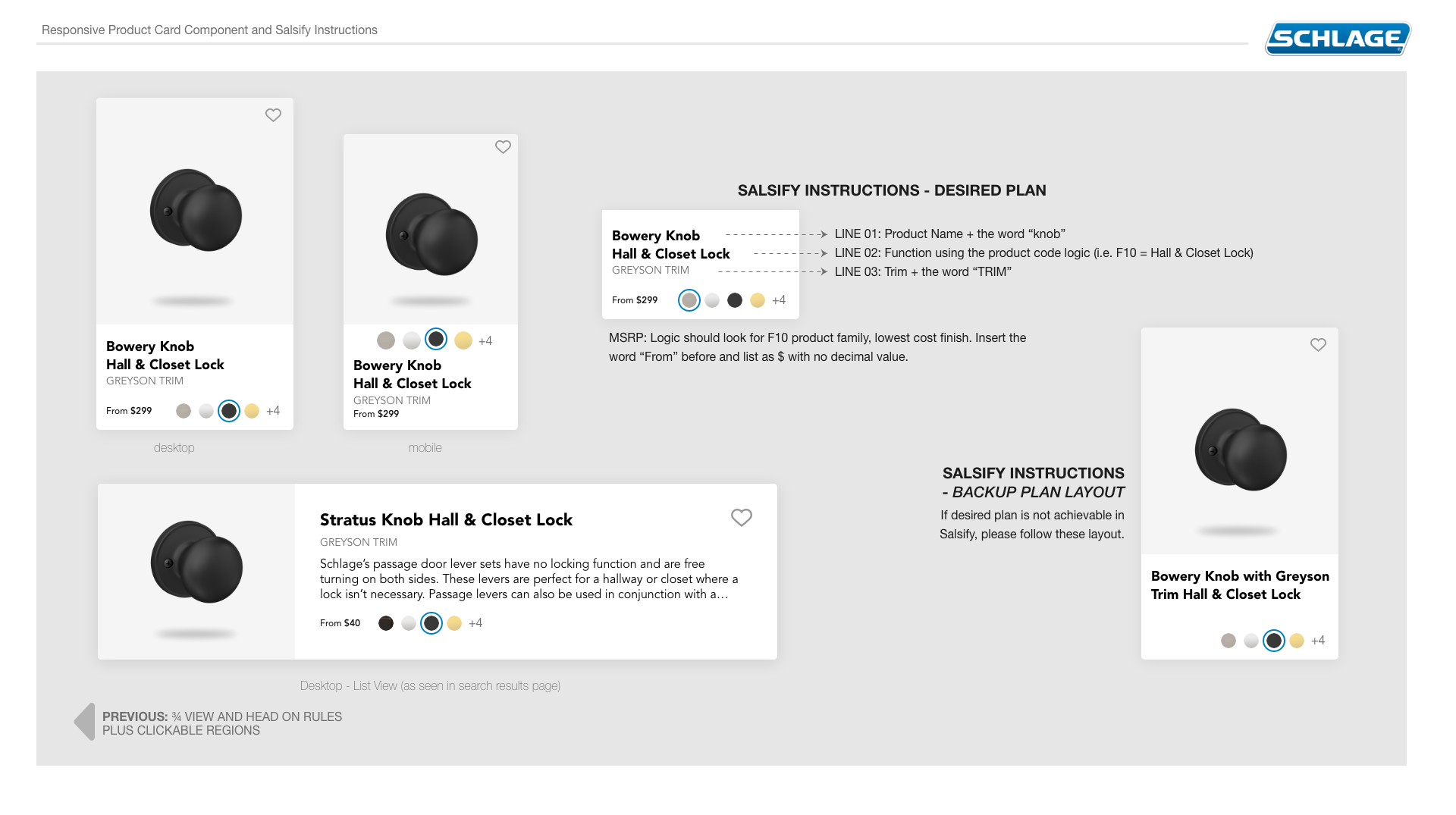
Static artboards aren't enough
For a site with complex interactions — favoriting products, search, navigation, and dynamic inventory-driven layouts — static designs don't communicate the full intent. Motion prototypes were created for key interactions to facilitate both rigorous user testing and precise developer handoffs. The goal was to remove ambiguity at every decision point before engineering investment was made.
"Static artboards simply aren't enough for thoroughly testing complex patterns such as favoriting an item or searching for help. Micro-interactions require comprehensive prototyping before developer handoff."
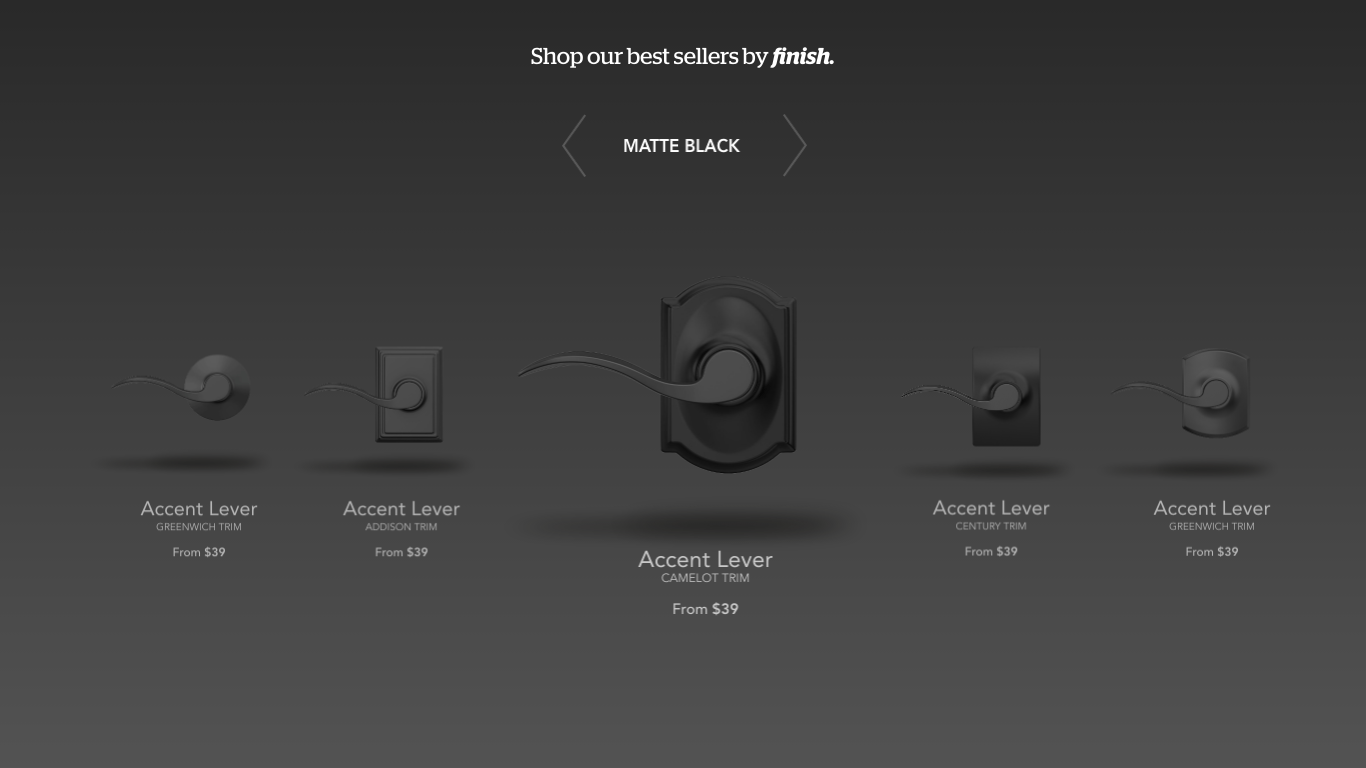
Documentation played a critical role alongside prototyping. Element documentation gathered stakeholder feedback, secured development alignment, and ensured the design team understood how dynamic content — database and inventory changes — would impact layouts across states.
Quantitative data at every stage, not just the end
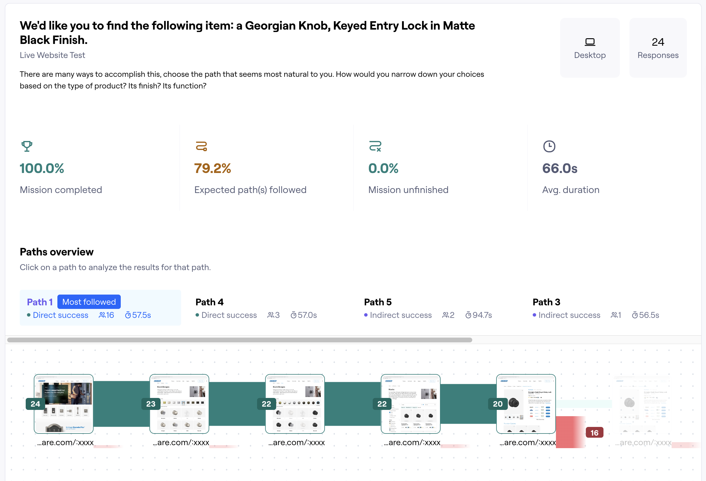
Opinions are easy to come by. What the project needed was quantitative evidence. Testing wasn't a single gate at the end of the design process — it was embedded throughout, with tools selected to answer specific questions at specific stages: tree testing to validate information architecture before building navigation, and prototype testing to validate interaction models before committing to implementation.
"It's easy to look at a design and give an opinion such as 'I like it' or 'I'm not sure this is going to work'. Without any quantitative stats, you really are missing the opportunity for insights, improvements, and confirmation."
Research-backed design, delivered at scale
The Schlage.com redesign delivered a full-stack UX engagement — from foundational user research through a production-ready atomic design system and validated interaction models. The dual workstreams of e-commerce UX and design system architecture were executed in parallel, ensuring the final designs were both user-tested and built to scale with the platform's evolving product catalog.
What this project reinforced about end-to-end UX
Running a design system and an e-commerce UX engagement in parallel is genuinely difficult — and genuinely worth it. The temptation on projects like this is to treat the design system as a cleanup task: something you build after the product designs stabilize. That approach creates rework. Building the atomic foundation first — even when it slows the early phases — means every component you design later is already governed, already reusable, and already documented for development. The system pays back its investment within the first major feature cycle.
What I'd do again: the embedded testing cadence. Tree testing before navigation, prototype testing before interaction commitment, interview synthesis alongside quantitative data. Each layer added something the others couldn't — and each one surfaced at least one finding that would have cost significantly more to fix post-launch than it did to address during design. The goal isn't to test everything; it's to test at the moments where being wrong is most expensive.