OneTrust · AI Prototyping · Enterprise UX · UX Research
Unifying a rule builder used across an entire enterprise platform
How I audited five distinct, incompatible rule builder implementations across OneTrust's product suite, defined a single cohesive design standard, and validated the solution through head-to-head Maze testing — delivering a component built to scale.
5+
Inconsistent rule builder variants found across the platform
A/B
Interaction patterns validated via Maze usability study
6th
Generation prototype — iterated to production-ready fidelity
My Role
Sr. Principal UX Design Lead
Timeline
March 2026
Platform
Enterprise SaaS
Core Tools
Figma · Maze · OneTrust DS
Contribution
Sole Designer
01 — Context
The same task, built five different ways
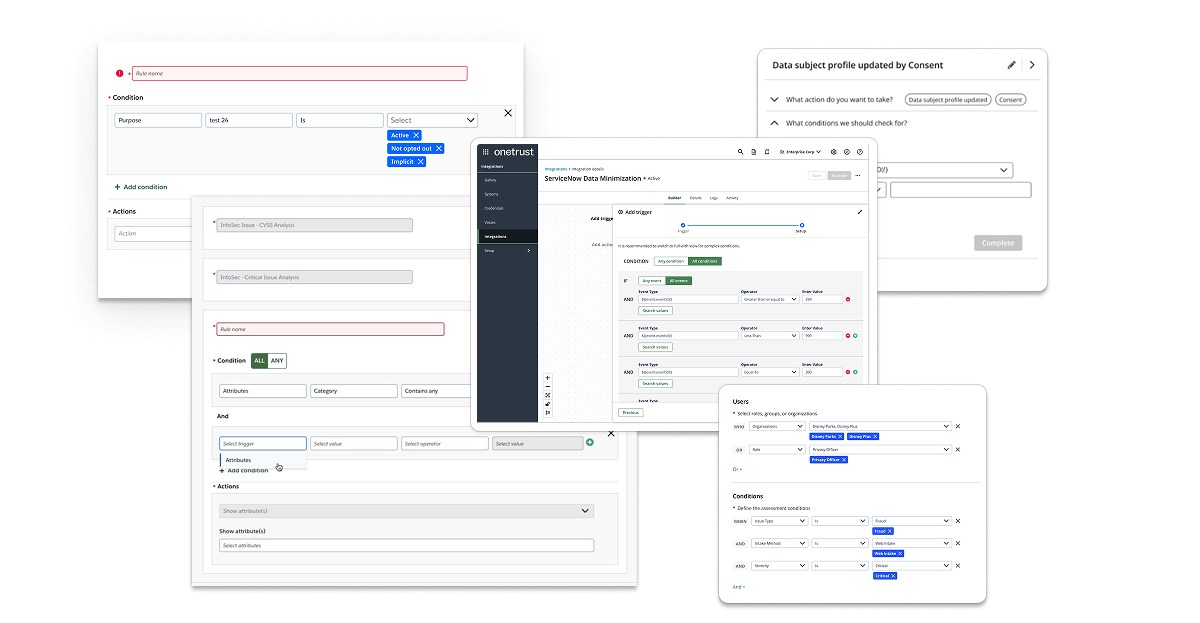
Rules and logic are at the heart of what OneTrust's platform does — users define conditions to trigger automation, enforce data policies, and configure complex workflows. But the component they used to do it wasn't a component at all. It was a collection of one-offs: some products used dropdowns, others used checkboxes, some used free-text inputs, and others launched modal dialogs. Each team had built their own interpretation of the same interaction.
The "MS-Rules UI" in the design system's component library served as a nominal foundation, but adoption was inconsistent. The result was a fragmented experience where a user working across multiple OneTrust products — Privacy, Integrations, Data Discovery, AI Governance — would encounter a completely different rule-building paradigm in each one. Re-learning the same interaction multiple times across the same platform is a fundamental UX failure. That's what this project set out to fix.
"OneTrust's Rule Builder component (variations on) show strong intent but lack cohesiveness and robustness. Consistency in control placement, labeling, and interaction models is missing — compromising discoverability and reducing the likelihood of successful self-service."
02 — Audit & Discovery
Five categories of failure, one component
Before touching a single frame in Figma, I conducted a comprehensive audit of every rule builder implementation across the OneTrust platform. This meant cataloguing each variant, documenting how it handled property selection, operators, value inputs, logical grouping, and error states — then comparing them systematically. What I found was worse than expected: inconsistency wasn't just present across products, it existed within the same product, on the same page, depending on which view a user selected.
5+
Distinct rule builder implementations found across the platform
3+
Features where inconsistent UX patterns appeared within the same workflow
0
Shared UI patterns, templates, or validation feedback across implementations
The audit surfaced five distinct problem categories:
⚠
Inconsistent Implementations ("One-Offs")
Dropdowns, checkboxes, free-text fields, and modal dialogs — each product team had independently interpreted the same user task. Users were forced to re-learn the same interaction every time they crossed a product boundary, compounding cognitive load and undermining efficiency.
⧉
No Shared Patterns or Visual Structure
Some implementations rendered each rule as a separate line item with property/operator/value fields; others grouped conditions under a single panel. Even collapsed states varied — toggle placement and container background colors were inconsistent across actual-size views of the same product area.
⛓
Limited Scalability & Logical Complexity
Available builders could handle simple AND/OR relationships, but not nested logic — the kind users actually need for real business conditions (e.g., "1 AND (2 OR 3)"). Without parentheses support or clear logical group labeling, complex rules became impossible to build, read, or debug.
◫
No Templates, No Context-Awareness
Users had no pre-configured rule templates to reduce setup time or promote best practices. Operator lists didn't adapt to data type: a text field and a numeric field surfaced the same set of comparators. The system didn't know what the user was working with, so it couldn't help them work faster.
◉
Poor Visual Feedback & Rule Management
No inline preview, no syntax validation, no clear indication of whether a rule was well-formed or actionable. Removing or reordering clauses worked differently across instances — sometimes via icon buttons, sometimes via drag handles — creating unnecessary interaction friction at critical decision points.
03 — Design Strategy
Defining what a rule builder should actually be
Before designing anything, I needed to establish a working definition — a reference specification for what a complex yet flexible rule builder does, so that every decision made downstream could be measured against it. This wasn't just a UX exercise; it became the conceptual foundation I used to align stakeholders, inform component architecture, and scope the Maze validation.
I also surveyed how the industry's most respected design systems had approached this problem. IBM's Carbon, Salesforce Lightning, Atlassian, Google Material, and Shopify Polaris were all evaluated. The finding was notable: none of them ship a rule builder as a ready-made component. They provide the building blocks — selects, inputs, toggles, buttons — and assume product teams will assemble them. This meant OneTrust had an opportunity to do something genuinely differentiating: build a governed, reusable rule builder that didn't require each team to reinvent the wheel.
☰
Property Selection
Fields or dataset attributes (e.g., "Country," "Purchase Amount," "Status") surfaced in context
≡
Context-Aware Operators
Comparators that adapt to data type — "contains" for text, "greater than" for numeric — not a one-size list
◫
Typed Value Inputs
Input fields that match the property type — text, numeric ranges, date pickers — reducing input errors
⛓
Nested Logical Grouping
Support for simple AND/OR and nested expressions like "1 AND (2 OR 3)" for real-world rule complexity
⊟
Visual "Lines" with Controls
Each clause in its own row with intuitive Add, Remove, drag-to-reorder, and grouping controls
◉
Live Preview & Validation
Real-time logic expression preview; highlighting for invalid or ambiguous clauses before submission
◱
Templates & Smart Defaults
Pre-configured rule patterns common to the use case — reducing setup time and cognitive effort at the start
⌨
Free-Form Switching
Toggle between structured visual mode and free-text/SQL-like expression mode for advanced users
Component Anatomy
Documented anatomy: collapsed and expanded states, status indicators, and action groupings
What the market got right — and what it left unbuilt
With the internal audit complete and a working definition established, I used Claude Cowork to conduct a systematic sweep of how competing products and major design systems had approached rule building. The goal wasn't inspiration — it was triangulation. Understanding where the market had converged on patterns would tell me which decisions were already settled, and where genuine differentiation was still possible.
The sweep covered both design system primitives (IBM Carbon, Salesforce Lightning, Atlassian, Google Material, Shopify Polaris) and standalone products with mature condition builders (Zapier, Segment, Braze, Amplitude). The finding across design systems was consistent: none of them ship a rule builder as a ready-made component. They provide the building blocks and expect product teams to assemble them. Standalone products were more instructive — each had made deliberate choices about how to structure the Property · Operator · Value triplet, handle logical grouping, and communicate rule state to users.
5
Major design systems evaluated — none shipping a ready-made rule builder component
4+
Standalone products with mature condition builders analyzed for interaction patterns
0
Competitors offering AI-assisted rule building as a native, integrated feature
Across every evaluated product, the same core patterns surfaced consistently — representing the settled conventions that any rule builder needs to meet before it can differentiate:
☰
Property · Operator · Value as the base unit
Every mature rule builder organizes conditions as a triplet: a property (what you're evaluating), an operator (how you're comparing), and a value (what you're comparing against). The triplet is the atomic unit — get it wrong and everything built on top of it breaks.
⛓
AND/OR toggling at the group level
Logical connectors (AND, OR) operate on groups of conditions, not individual clauses. Products that placed the toggle at the wrong level — between individual rows rather than at the group header — consistently produced confusion in usability testing across the evaluated set.
⊟
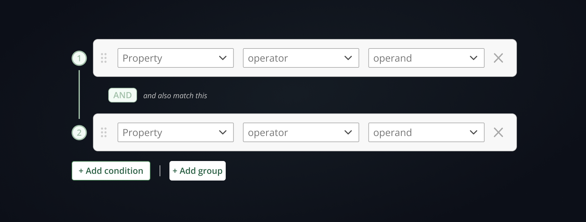
Explicit add controls, not implied affordances
The highest-performing pattern across all evaluated products used distinct "Add condition" and "Add group" buttons rather than contextual hover controls or inline + icons. Explicit affordances outperformed minimalist approaches consistently — particularly when users were building nested logic for the first time.
◉
Rule summary / plain-language preview
Products that rendered the constructed rule as a human-readable sentence — "If Country is US AND Purchase Amount is greater than 100" — alongside the visual builder dramatically reduced user errors and increased confidence before submission. No competitor had extended this to AI-generated natural language input.
The gap in the market was clear: every competitor had built a better mousetrap for constructing logic manually. None had asked whether the user needed to construct it manually at all. That insight — that an AI-assisted input layer could scaffold rule conditions from natural language descriptions — became the defining differentiator of the OneTrust implementation.
Claude CoworkCompetitive AnalysisIBM CarbonSalesforce LightningZapierSegment
05 — AI-Assisted Prototyping
Building functional prototypes with Figma Make and Claude Opus 4.6
The competitive research had identified the gap. The next challenge was proving the concept worked — not just as a static mockup, but as a functional, interactive prototype that could be put in front of users and tested. This is where the process shifted from traditional UX design into something new: using Figma Make, powered by Claude Opus 4.6, to generate working functional prototypes directly from detailed design mockups.
The methodology was deliberate. Rather than using AI as a generic code generator, I structured the Figma mockups as a communication layer — every layer was labeled with precision and intent. Component names like condition-row, operator-dropdown, add-condition-btn, and logic-group-header gave the model the context it needed to understand component relationships and wire up interactive behaviors accurately. Prompts were written to describe intent, not just appearance — specifying what each element should do, what state changes should look like, and how the logic should flow between components.
1
Intentional Layer Labeling as a Prompt Layer
Before engaging Figma Make, every component in the mockup was labeled with functional intent. Layers weren't named for organization — they were named to communicate behavior. This approach dramatically improved the quality of the generated prototype logic on the first pass, reducing iteration cycles needed to get the interaction model right.
2
Iterative Prototype Generation (Six Generations)
The prototype went through six generations of iteration — each cycle incorporating feedback from usability testing, stakeholder review, and functional testing. Claude Opus 4.6 handled the implementation of each iteration, allowing design feedback to be translated directly into a working prototype without a separate development handoff cycle in between.
3
Wiring the AI Rule Builder Module
The most complex use of Figma Make was wiring the logic for the AI-assisted rule builder — the feature that set the OneTrust implementation apart from every competitor. Users could describe a rule in natural language ("notify me when a high-risk data subject submits a request from the EU") and the module would scaffold the corresponding conditions automatically. Claude Opus 4.6 was used to implement the suggestion engine logic, mapping natural language intent to Property · Operator · Value condition triplets.
4
Final Review with Claude Cowork
Each prototype generation was reviewed using Claude Cowork before advancing to user testing. Reviews covered three areas: UI consistency with the OneTrust design system, logical correctness of nested AND/OR expressions under edge cases, and interaction model coherence across the full rule-building flow. This human-plus-AI review loop consistently surfaced issues that manual review alone would have taken significantly longer to catch.
The AI-assisted rule builder module was the feature no competitor had built. Rather than replacing the structured visual builder, the AI input layer sat above it — users could either construct conditions manually or describe their intent in plain language and let the module scaffold the logic. The two modes coexisted, giving both technical and non-technical users a path to the same outcome.
🤖
Natural Language Rule Input
Users describe their rule intent in plain language; the AI module translates it into structured Property · Operator · Value conditions automatically
✏️
Editable Scaffolded Conditions
AI-generated conditions are immediately editable — users can accept, modify, or reject any suggested clause before the rule is committed
🔀
Seamless Mode Switching
Users can toggle between AI-assisted input and manual structured building at any point in the rule-building flow without losing work
🔍
Context-Aware Suggestions
The suggestion engine surfaces condition options relevant to the product context — properties and operators appropriate to the specific data model in use
Figma MakeClaude Opus 4.6Claude CoworkFigmaIterative Prototyping
06 — Testing & Validation
Two approaches. One Maze study. A clear answer.
With the audit complete and the component architecture defined, the core design question came down to interaction model: how should users add conditions and build logical groups? I designed two distinct approaches and put them head-to-head in a Maze unmoderated usability study to let actual users resolve the debate.
Common Pattern
Preferred
Uses explicit "Add condition" and "Add group" controls to expand the formula and create nested logical expressions. Clear affordances, predictable structure.
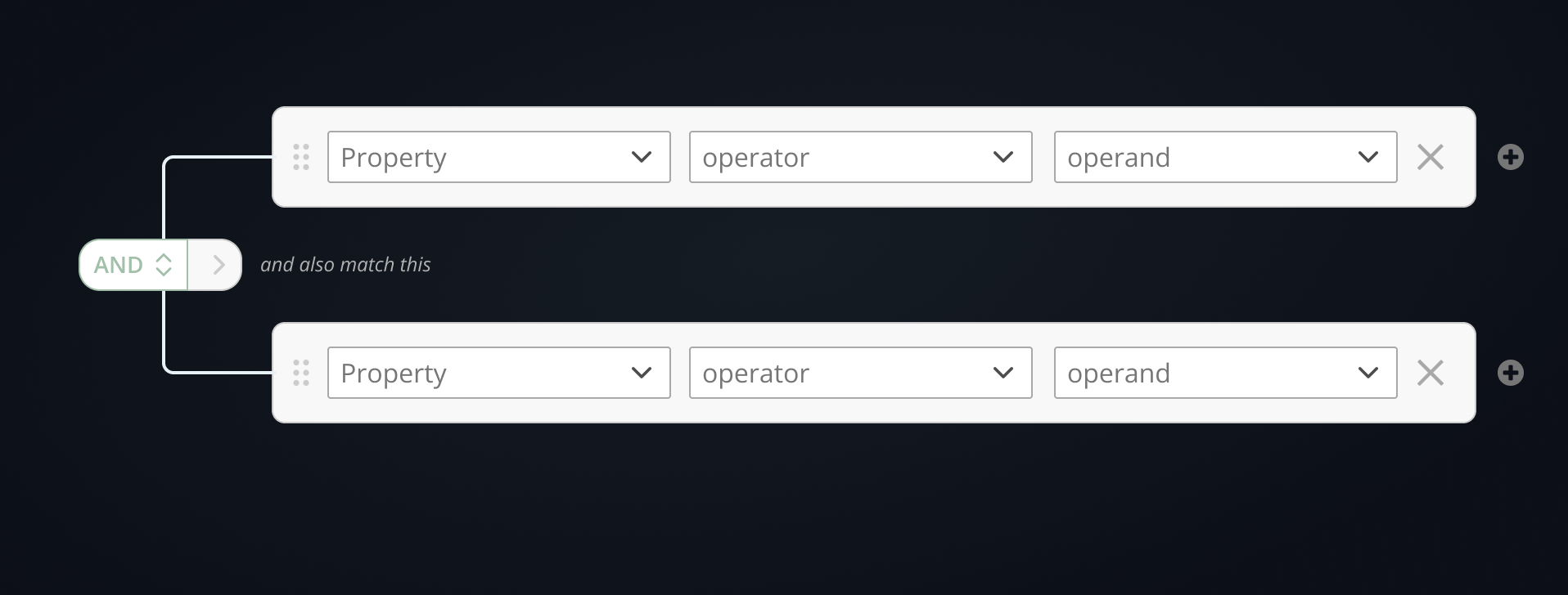
Minimalist Approach
Variant
Attempts to reduce visual overload by combining AND/OR toggling and nesting into a single multi-use control. Cleaner visually, but less legible in practice.
The Maze study results were close — both patterns performed similarly on core tasks — but the Common Pattern was the clear user preference. The explicit affordances reduced ambiguity when constructing complex nested logic, particularly for less experienced users. The minimalist approach traded clarity for density in a way that didn't pay off at scale.
The study confirmed what the audit had suggested: when users are constructing formal logic, they want to see what they're building. Reducing visual noise at the cost of legibility is the wrong tradeoff for a component used to define business-critical rules. The Common Pattern — with its explicit "Add condition" and "Add group" controls — gave users a mental model they could trust, and that trust compounded as rules grew more complex.
07 — The Solution
A flexible component with intentional focus
The final design was built around a single principle: reduce cognitive load through intentional focus states, not by removing information. The component exists in two configurations — a "Complete View" with all features enabled, and a "Bare-Bones" mode representing the minimum needed to create a valid rule — so that product teams can deploy it at the right level of complexity for their context.
1
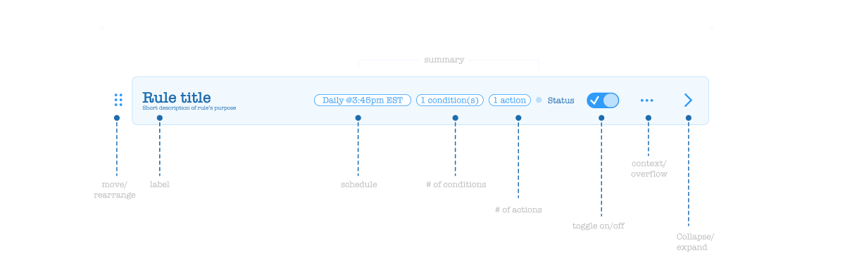
Collapsed State with Badges
Rules display in a compact row with status, condition count, and action count surfaced as badges. Consistent across every implementation — same pattern whether you're in Privacy, Data Discovery, or AI Governance.
2
Expanded Editable & Preview Modes
Expanded rules have two views: an editable state for building conditions and actions, and a preview (locked) state showing the rule in written form — reducing ambiguity about what the rule actually does before it's applied.
3
Contextual Conditions & Actions Panels
The Conditions panel supports nested AND/OR logic via "Add condition" and "Add group" controls. The Actions panel supports the same boolean structure, and can optionally surface fully customizable forms for complex, context-specific action types.
4
Intentional Focus & Collapsed Animation
The entire experience is designed around focus: intentional collapsed states and loading animations guide users sequentially through the rule-building process, preventing overwhelm when working with multi-condition formulas.
5
Optional Schedule & Custom Properties
Additional contextual fields — schedules, custom properties — are surfaced as optional layers that can be toggled off when not needed, keeping the default experience clean without sacrificing flexibility for advanced use cases.
Complete View
Full-featured configuration — all conditions, actions, preview, and optional properties enabled
Bare-Bones Mode
Minimum viable rule builder — stripped to the essential inputs needed to create a valid, actionable rule
Guidance for product teams on which deployment pattern to use — Basic, Tab/Drawer, or embedded workflow step
08 — Outcomes
One component, built to last across the platform
The Rule Builder project delivered more than a redesigned UI. It established a documented, validated standard that any OneTrust product team can now adopt — eliminating the conditions that created five incompatible implementations in the first place.
Key Results
✓
Single unified rule builder standard — documented anatomy, component mapping, and implementation guidance replaces five one-off implementations across the platform
✓
Maze-validated interaction model — the A/B study resolved a genuine design tension between two credible approaches, giving the recommendation a data foundation rather than opinion
✓
Sixth-generation interactive prototype — iterative fidelity that demonstrates focus states, nested logic, collapsed animations, and both Complete and Bare-Bones configurations
✓
Scalable architecture for product teams — three documented implementation patterns (Basic, Tab/Drawer, Step) so each product context gets the right deployment, not the same default
✓
Foundation for design system governance — the component joins the platform DS with usage guidance that reduces the likelihood of future one-offs appearing as the product suite grows
09 — Reflection
What this project reinforced about platform-level design
Honest Retrospective
The most surprising part of this audit wasn't finding five different implementations — it was finding inconsistency within a single feature. When the same product uses two different rule builder patterns depending on which view a user opens, the problem isn't a lack of standards. It's that standards weren't enforced at the decision point where those views diverged. That's a governance failure, not a design failure — and it's a reminder that creating a great component is only half the job. Getting teams to actually use it consistently is the other half.
What I'd do again: using Maze to resolve the A/B question before committing to the final design. The two interaction models were genuinely close — reasonable designers could have argued for either. Having participant data, not just preference, made the recommendation defensible in a way that personal conviction wouldn't. When the stakes are a component that will touch every major product surface in the platform, "I think this one is better" isn't a sufficient answer.